Cheer, Fatima
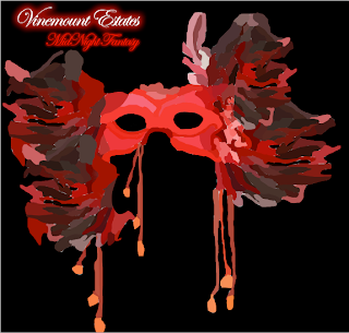
So as you can see I have stared to already finish the mask half way up, and now you can see how far I have gotten into coloring and shading it in, and now you can kinda see how its forming into a mask, so I am pleasantly very happy with it and think it incorporates my sexy wine label design because it's classy and appropriate, and consumers would right away understand that its a sexy but yet modern design that would attract many people because its not very often wine or other companies would provoke a mask, instead they would use a sexy girl and make her look seductive and I thought that was something very typical and wanted to do something out of the ordinary that would catch their eyes and think about it and understand that their are many versions of sexy but this one was not something they would expect. So thats my stage so far I hope you like it and look forward with the final design.
Until Then, Cheers Fatima
Well I guess I can say that I'm finally done! So as you can see I have finished the whole mask and that it looks pretty good and that I got alot of positive feedback on it which I was glad. Also as you can see I added the "Vinemount Estates" which is the company's name that I will be supplying the image for, and added the slogan" Midnight Fantasy" with some text effects such as the "Vinemount Estates" where I made the font a cursive to give it that sleek sexy feel to it and put a red outer glow on it. As for the slogan I chose the word "MidNight Fantasy" because by saying midnight fantasy I thought instantly of a masquerade party where the girls wear a mask which I thought that was very mysterious and sexy, so keeping it classy and appropriate and think that this was the perfect way to describe the whole outcome of the design where consumers would be attracted to be buying the wine bottle.
Thanks again for checking up on it and watching my process though out the design and hope you enjoyed it as much I enjoyed making it!
So until then Cheers, Fatima
Hello Again! well Im back with my second wine label design number two and of course wanted to show you my first stage of my design, So as you can see I sketched out some thumbnail designs and was playing around with what my concept was going to be and after drawing some ideas I finally knew what I wanted to do, I drew a grape and leaves border because it was suppose to be conservative, so thought that was a good start, then drew some grapes and the title "Fifth Road Estates"arranging where they would be placed and after I drew a basket with grapes falling out of the wooden basket to provoke that "fresh from the market barn" feel to it, and finally had the idea drawn down!
Hello Everybody! So as you can see I roughly sketched a grape and leaves border because the theme of my design is supposed to be very fresh and nature looking. Furthermore I also added grapes and leaves all around the border which thought would incorporate the background well, and added the wine glass to the left, because i wanted them to see I can incorporate the company's label by placing a wine glass and grapes that would blend together naturally. Furthermore I will soon add the wooden basket with the grapes falling down but I just wanted to show you how far I got and give you an idea how its going look when its all cleaned up. So thats it for now and don't forget to check out my next stage though out the process.


No comments:
Post a Comment